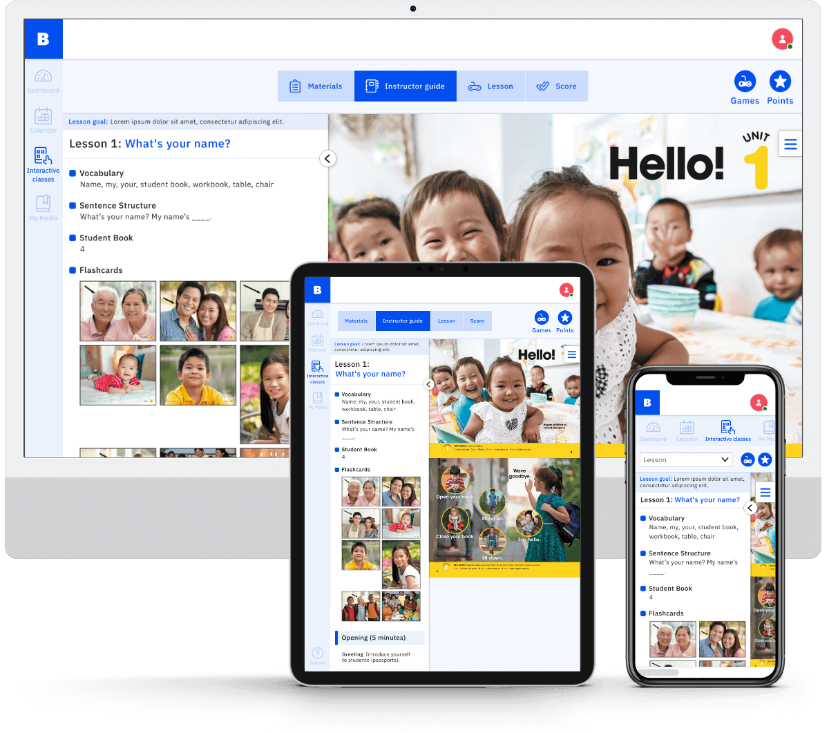
Berlitz Kids Legacy Transformation
Updating a language learning environment for kids as young as five.
- UI
- EdTech
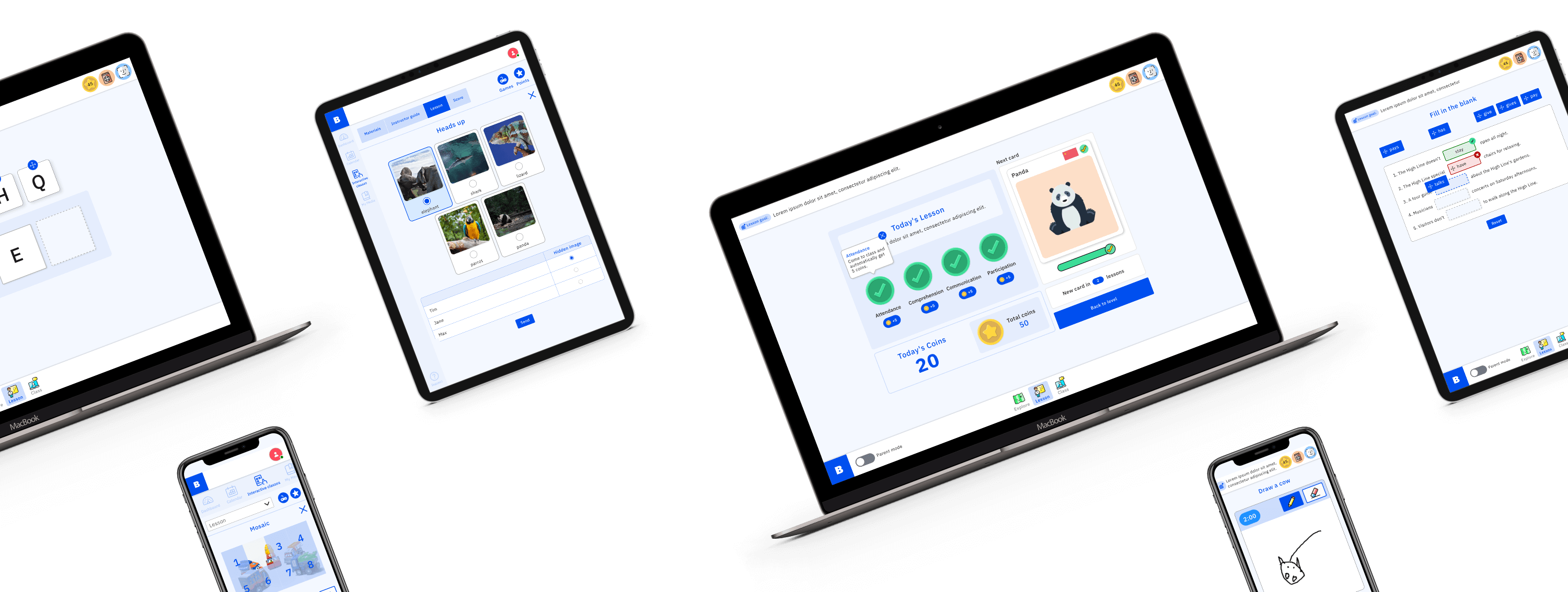
As you can imagine teaching kids is very different to teaching adults, so the learning environment requires a different set of tools.
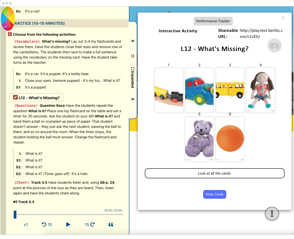
For kids and teens, interactive and instructor led activities form the basis for learning a language.
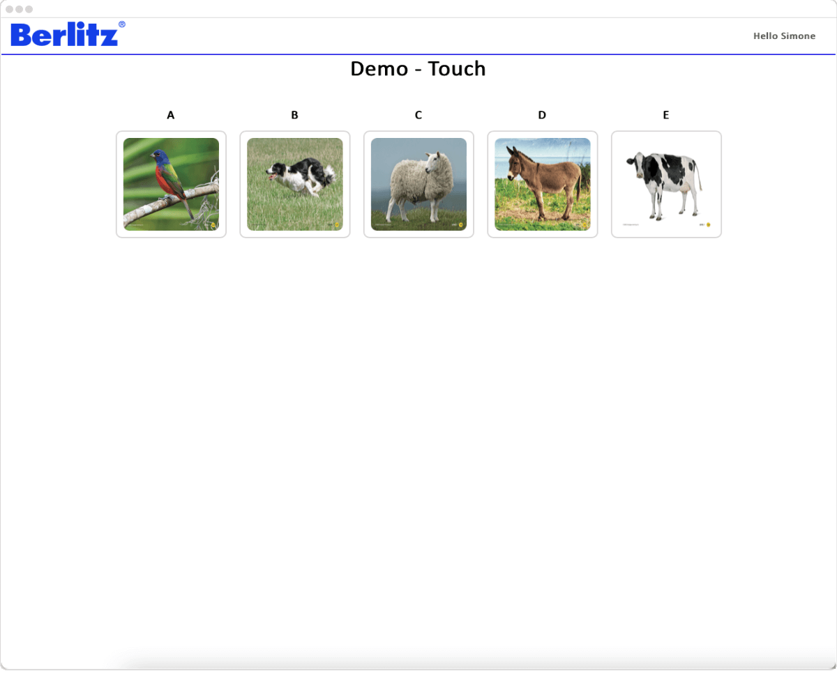
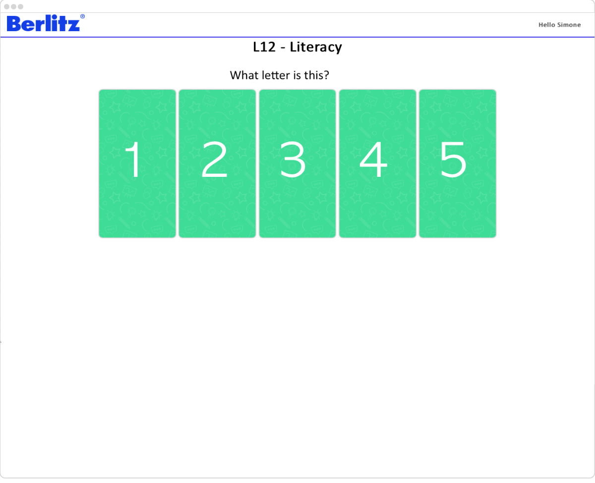
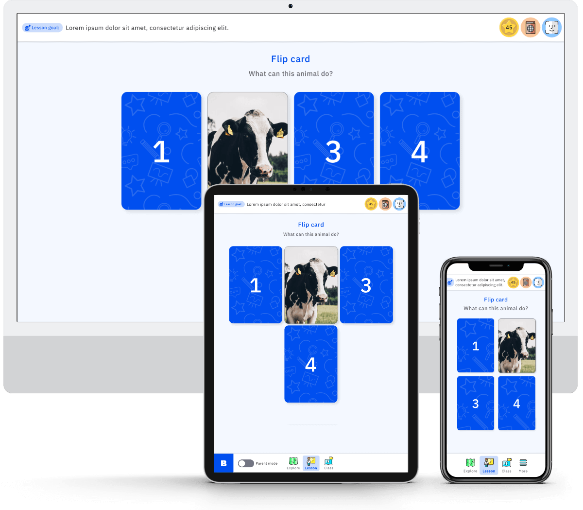
A instructor and student system already existed, so the student activities got a UI refresh, while the instructor environment was improved by our UX designer, and then styled with the Berlitz brand by me.
Student interface
When you have kids aged five and upwards it's hard creating a style that appeals to all. For the first phase of this project a UI was created which maintained the Berlitz brand, while also bringing a little playfulness that would be generic enough for a large age range.

Instructor interface
The instructor UI was designed to incorporate our instructor sidebar and toolbar from the portal project I was also working on, and the UX was improved so that instructors had more room on screen and a better navigation flow.

